~*~~*~
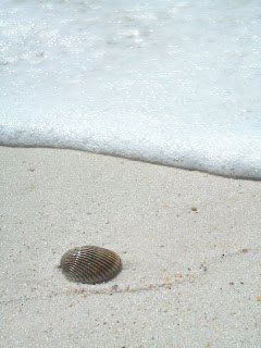
Hi all! This is Margaret! Eleanor told me that since we changed the name of this blog to "The Dashwood Sisters" so we can have a wider variety to post about, she said I could post some of my photography on here! So I have---this is my favorite picture lately! :) I took it in Florida last month.

And here it is photo-shopped (sp?) on Picnik. :) I'm still experimenting with Picnik to see what all it has, so this isn't that good, but tell me what you think. Which do you like better? The original or the photo-shopped? :)

-Margaret
P.S. Don't forget to look at Eleanor's most recent post: "North & South (2004) - A Review". :)


Comments
I like both of the pictures!
Love you!
Your sis,
Elinor :-D
(Kings and Queens, Meg! :-D)
LOOKS JUST AWSOME!
To the KING be all the glory!
Rebekah
BLOG: http://www.donotgrowweary.com/blog
"Be diligent to present yourself approved to God as a workman who does not need to be ashamed, accurately handling the word of truth." 2 Timothy 2:15
-Margaret